Optimal Android Launcher Experience on Large Smartphones: Why Niagara Excels

Optimal Android Launcher Experience on Large Smartphones: Why Niagara Excels
Quick Links
Phones are big. This includes the iPhone, but Android phones especially are very big. Thankfully, Android allows you to use different home screen launchers. If you have one of these large phones, you should give Niagara Launcher a try.
While it certainly can be nice to have a large screen, it’s hard to reach everything with one hand. Niagara Launcher is very different from most home screen launchers. Its vertical layout makes it much easier to open an app with just one hand—among other cool features.
Home Screen Reimagined
What sets Niagara Launcher apart from other launchers is its vertical layout. Typically, home screens place icons in a grid. That’s the standard practice we’ve seen on phones going all the way back to the original iPhone.
The problem with this layout on big phones is you can’t reach the whole grid with one hand. You could move the icons to make them easily reachable, but then you’re wasting a bunch of screen space. Niagara Launcher solves this by putting the apps in a vertical list.
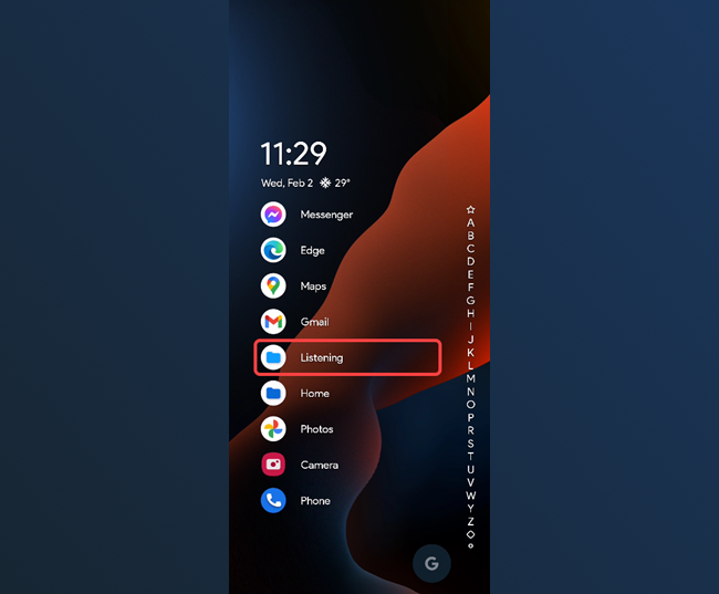
Here’s how I have my home screen set up with Niagara Launcher. Since the apps are in a vertical list, the touch targets span across most of the screen. It’s super easy to launch an app with just one hand holding the phone. The Google Search shortcut in the bottom right is also very reachable.
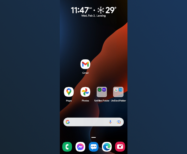
Here’s what the same apps and widgets would look like on a more typical home screen launcher. I have the same amount of empty screen space, but Niagra organizes everything in a much more consistent and cleaner way.
One-Handed App Launching
Perhaps the best thing that makes Niagara Launcher great for large phones is the “app drawer.” I put “app drawer” in quotes because it’s very different from most app drawers.
Typically, you would tap an icon to open the app drawer and then scroll through a grid of icons. Niagra Launcher has the alphabet on the side of the home screen and you can simply drag your finger up and down over it to find the apps under that letter.
Not only is this super slick, but it makes it easy to launch apps with one hand. You can drag your finger up and down either side of the screen and quickly pull up the app you want. It’s also oriented closer to the bottom of the screen, further improving the reachability.
Easy Access to Important Notifications
The last thing I really like about using Niagra Launcher on big phones is how it makes notifications easier to reach. First, you can simply swipe down on the home screen to pull down the notification shade. You don’t have to reach the top of the screen.
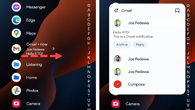
More importantly, you can have notifications show up on the apps on the home screen. You can see a little preview and swipe right on it to expand the full notification and even take action on it.
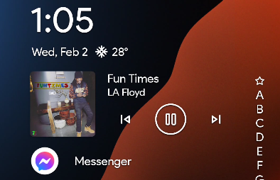
You probably put your most frequently used apps on the home screen, so this makes those important notifications very easy to access. Speaking of commonly used things, you can also put a media widget on the home screen for quick controls.
Big phones require a little imagination to make them easier to use. Niagara Launcher is a refreshing new take on Android home screen launchers . It takes a little getting used to, but if you give it time, you’ll learn to love it and it will become second nature.
Related: image.png
Also read:
- [New] YouTube Shorts Demystified in 30 Minutes
- [Updated] In 2024, Virtual Voyage Unlimited The Ultimate Selection of Free Roleplayers
- 2024 Approved Instagram Videos Wandering - Why Angles Change?
- ACID Pro Alternatives A Comprehensive Guide for 2024
- Adata's DDR5 Memory Module Achieves Impressive 8118 Million Transfers per Second Speed
- AI Unleashed: Groundbreaking GPT Developments That Matter Most
- Alder Lake Intel Core I5-12400F Processor: A Comprehensive Review of the High-Performance Pentium Gold G7400T CPU at a Record 5.8GHz Overclock
- AMD's Breakthrough Invention: Seamless Automated Memory Clock Boosting Solution
- Decoding T-Series' Online Earnings Stream for 2024
- Discover Cutting-Edge Electronics with Tom's Hardware Insights
- Dive Into Electronics with Tom’s Review: Comprehensive Hardware Guides
- Enhanced AMD Fabric Tuning: Now Compatible with Active and Passive X570 Boards Post-Update
- Essential Guide to RAM Overclocking on ASUS ROG Strix X399-EVO: How Fast Should You Go?
- Essential Insights Into Hands-Free Interaction
- Exploring Cutting-Edge Gadgets with Tom's Hardware Insights
- Exploring the World of Computing with Tom - A Guide by Tom's Hardware Experts
- Exploring Vince Lucido's EVGA RTX 지오팩스 3090 Kingp!n: A Potential Crowned Champion of the RTX Series
- In 2024, Archive Your Antics A Practical Guide to Capturing and Storing GIF Images From Twitter
- In 2024, How To Track IMEI Number Of Huawei Nova Y71 Through Google Earth?
- In 2024, Streamlining Content Tweeting Videos on Snapchat
- Insightful Evaluation of Sunfounder's Piranman 5 Bike: Unpacking the Assembly Process
- Introducing Galax's New High-Performance Motherboards with DDR5, Powerful VRM & PMIC Features!
- KineMaster App for Android A Comprehensive Insight Review for 2024
- Mastering In-Stream Ads on Facebook Configuration & Analysis Guide for 2024
- Maximize Your Skylake Processor's Potential with the Perfect Overclocking-Compatible Motherboard
- Navigating the Circuitry: Expert Insights From Tom's Electronics Hub
- Navigating the Tech World with Tom: Expert Insights Into Hardware Advancements
- Overclocking & Modding Guide: Enhancing Intel Core I7-7700K with a De-Lidded Design
- Photos That Speak Volumes Starting with LunaPic's Tutorial for 2024
- Revolutionary Update by ASRock Allows Locked Comet Lake-S CPUs to Overclock on Non-Z Motherboards
- Ryzen 4000 Series Sets New Standards: The Renoir Chip Achieves World Record at 6666 MHz
- Solved Dolby Advanced Audio: Unable to Start the Dolby Audio Driver in Windows 11
- Tom's Tech Gear: Precision in Computing Devices
- Tom's Tech Insights: Unveiling the Latest in Computer Hardware
- Tom's Tech Review: Comprehensive Analysis and Guides on Hardware
- Tom's Tech Review: Comprehensive Guides & Expert Insights
- Tom's Tech Review: The Ultimate Guide to Computer Components
- Tom's Tech Review: Your Go-To Source for Comprehensive Hardware Analysis
- Tom's Tech Reviews: Comprehensive Hardware Insights
- Tom's Tech Reviews: Expert Gadget Insights and Performance Analysis
- Tom's Tech Reviews: In-Depth Insights and Evaluations
- Unleashing the Power of Intel's Core I9-11900K: Achieving 7GHz Overclock with Advanced LN2 Techniques
- Unleashing the Power of Legacy: The Remarkable Journey of a Vintage 14-Year-Old Celeron D 347, Overclocked to an Astounding 8.37Ghz
- Unveiling Gadgets with Tom: The Ultimate Guide to Modern Electronics
- Title: Optimal Android Launcher Experience on Large Smartphones: Why Niagara Excels
- Author: Kevin
- Created at : 2024-08-28 04:23:12
- Updated at : 2024-08-29 04:23:12
- Link: https://hardware-reviews.techidaily.com/optimal-android-launcher-experience-on-large-smartphones-why-niagara-excels/
- License: This work is licensed under CC BY-NC-SA 4.0.


